
Our bedroom project is (maybe) finished!
You guys, a bedroom has never been my biggest priority in settling into an apartment. It never feels as important as the living areas, especially since it's usually covered in clothes and really just a place for sleep. But I'd been craving a change to this mindset for a while. And so for the first time in a long time (probably since living in our childhood homes), our bedroom feels truly purposeful and thought-out. It's a curated mix of bright, eclectic, lived-in, and cozy. I'm loving how this long work in progress has turned out, and the fact that very few things were actually new purchases.
I thought I'd mostly let the pictures do the talking, but I do think it might be interesting to share a little bit about how I got here. Because I failed to take "before" pictures (mostly because, there was never a clear start or finish to this project, which I think is honestly much more realistic for anyone with other things going on, as well as a limited budget), it feels especially important to talk about my order of operations in attacking the space, as well as what I learned throughout.
As a bit of background, my biggest personal struggle with decorating is having to remind myself (almost constantly) to not overcommit to one look, style, theme, color, etc. The "x" factor for most beautifully curated places that I look to for inspiration, in my opinion, is just enough inconsistency and unexpectedness to keep a space from feeling one dimensional or inauthentic. This seems to come easily to some people, but for me, concerted effort is required to stay away from the matchy-matchy, perfectly symmetrical tendencies that my personality sometimes leans towards. The result, though, is so much fun. I have loved learning how to step out of my comfort zone and put things together that feel slightly incongruent. As long as there is enough of a solid foundation, an overall genuine feel or vibe, the rest seems to fall into place quite easily (as long as you let it :)
Now, to get out of the clouds for a minute, here's more of an explanation of what I'm really talking about.
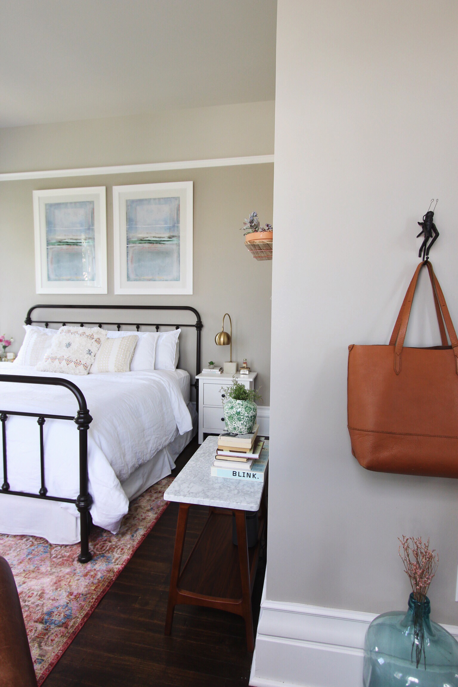
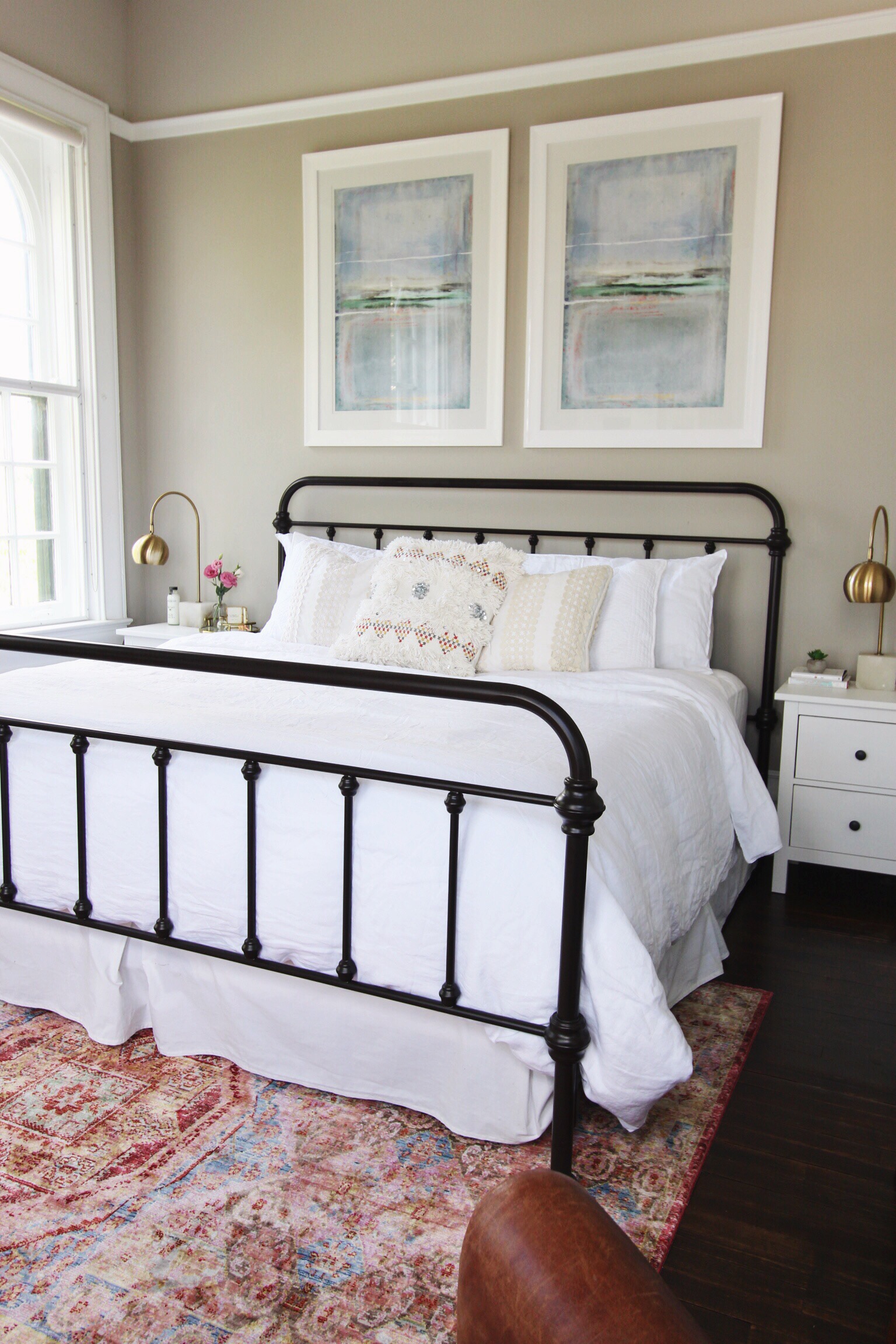
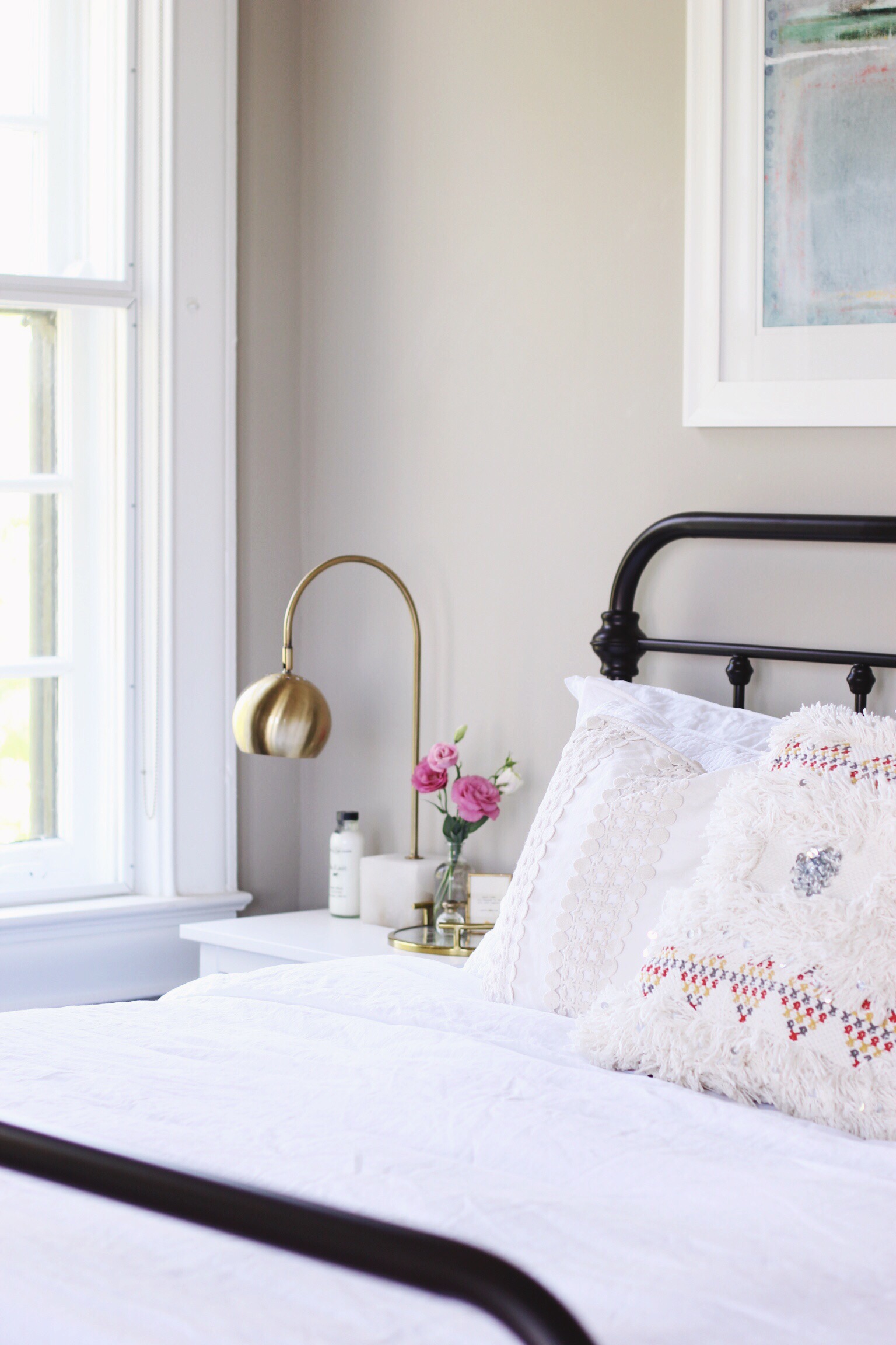
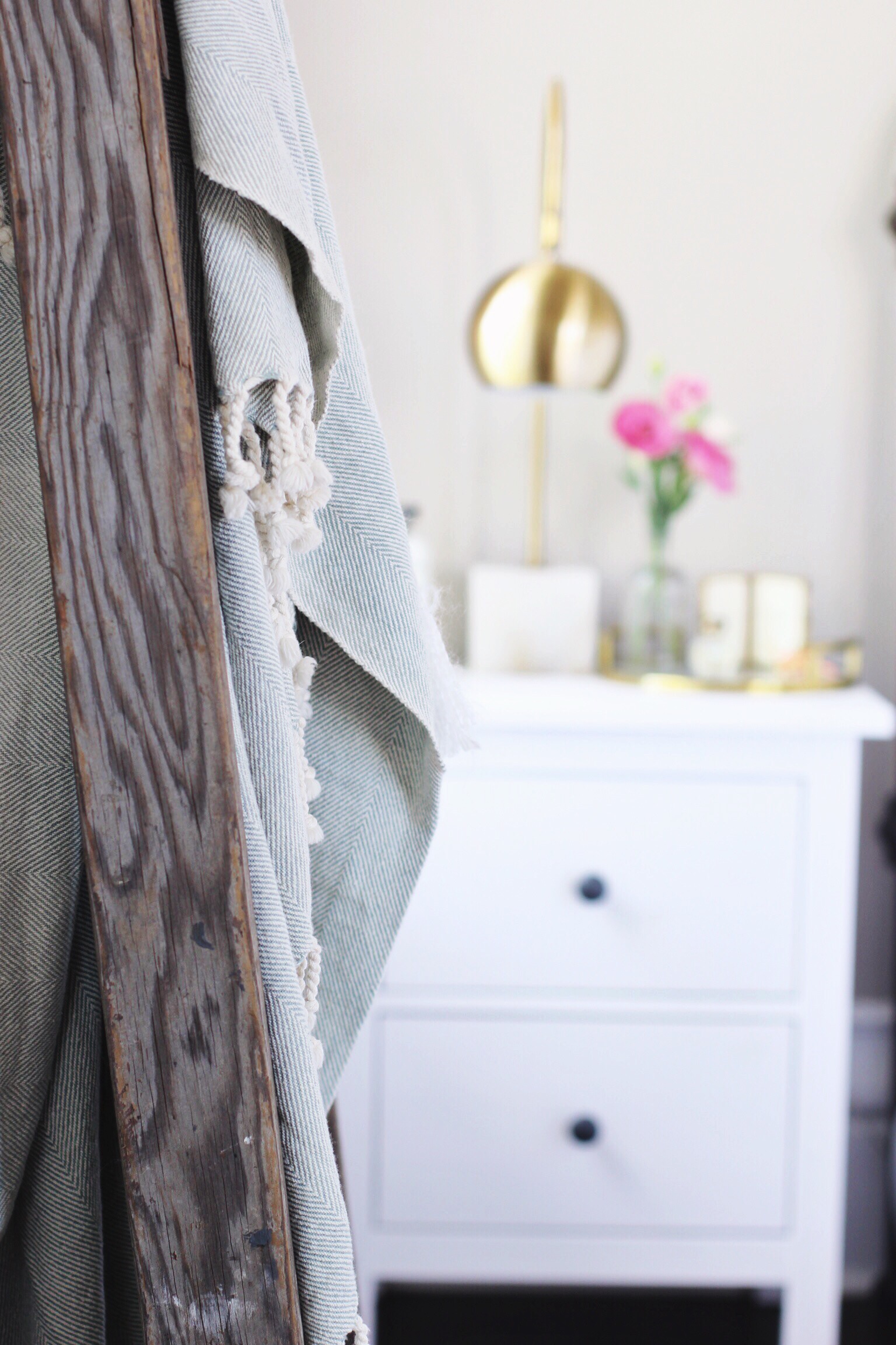
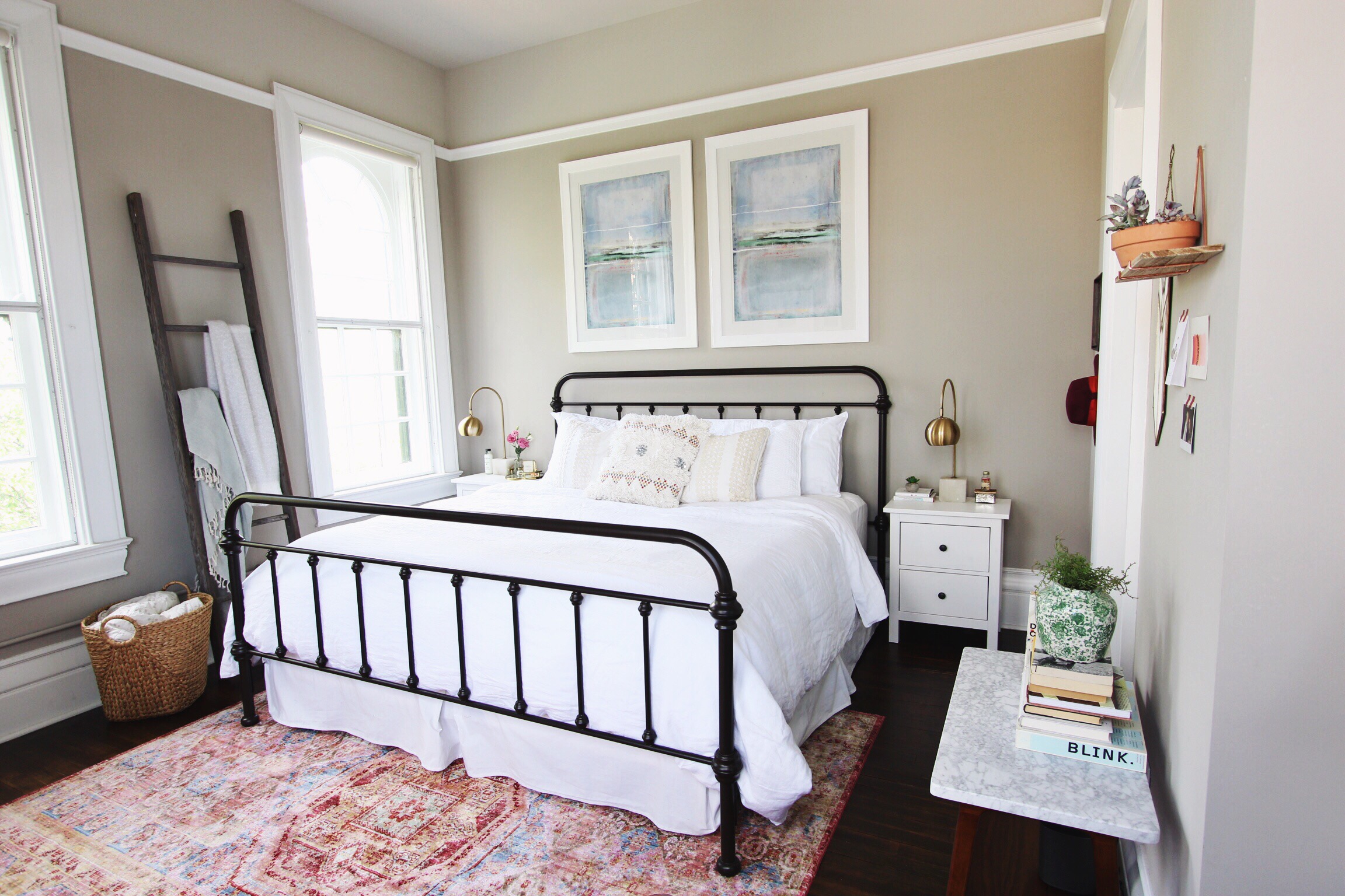
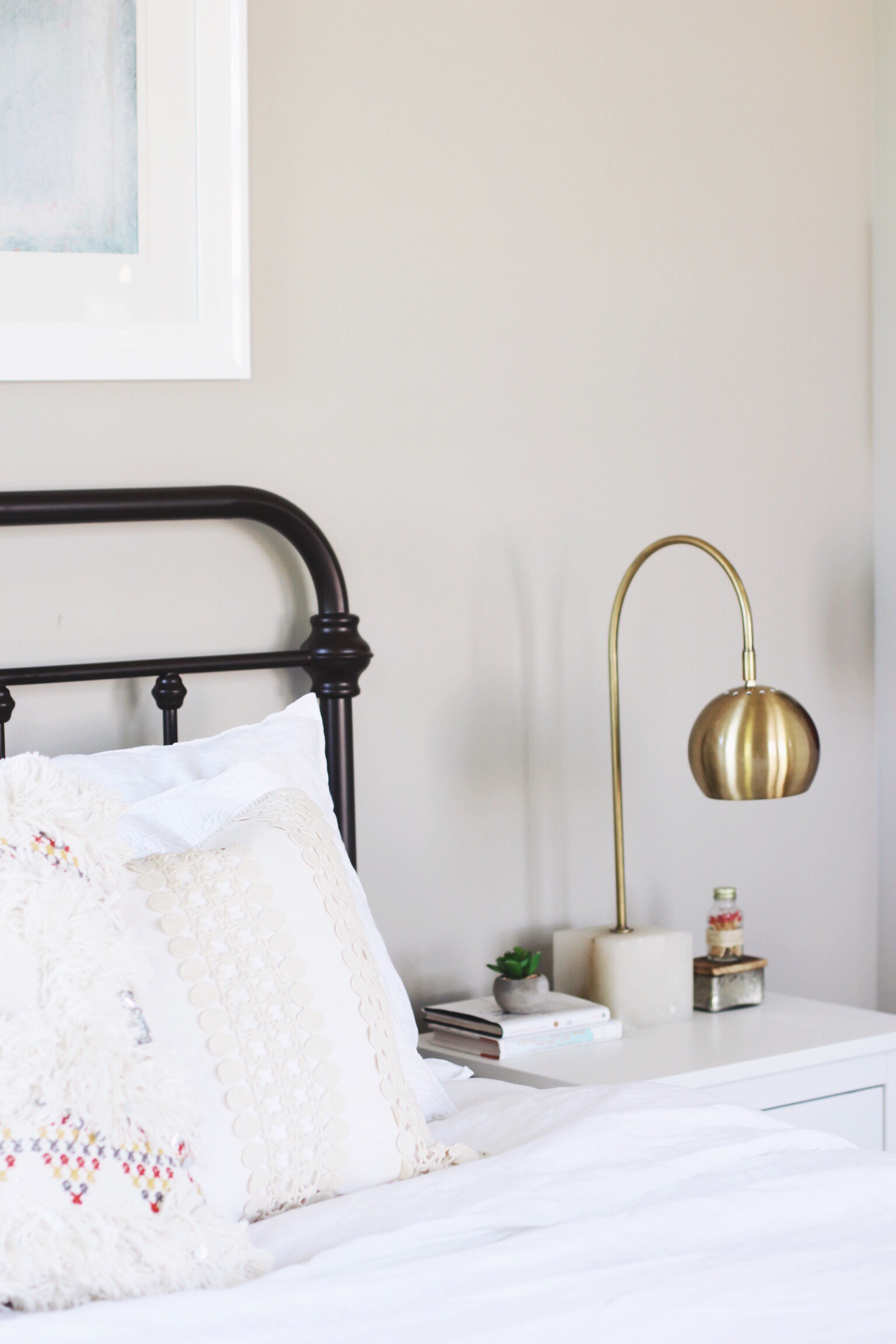
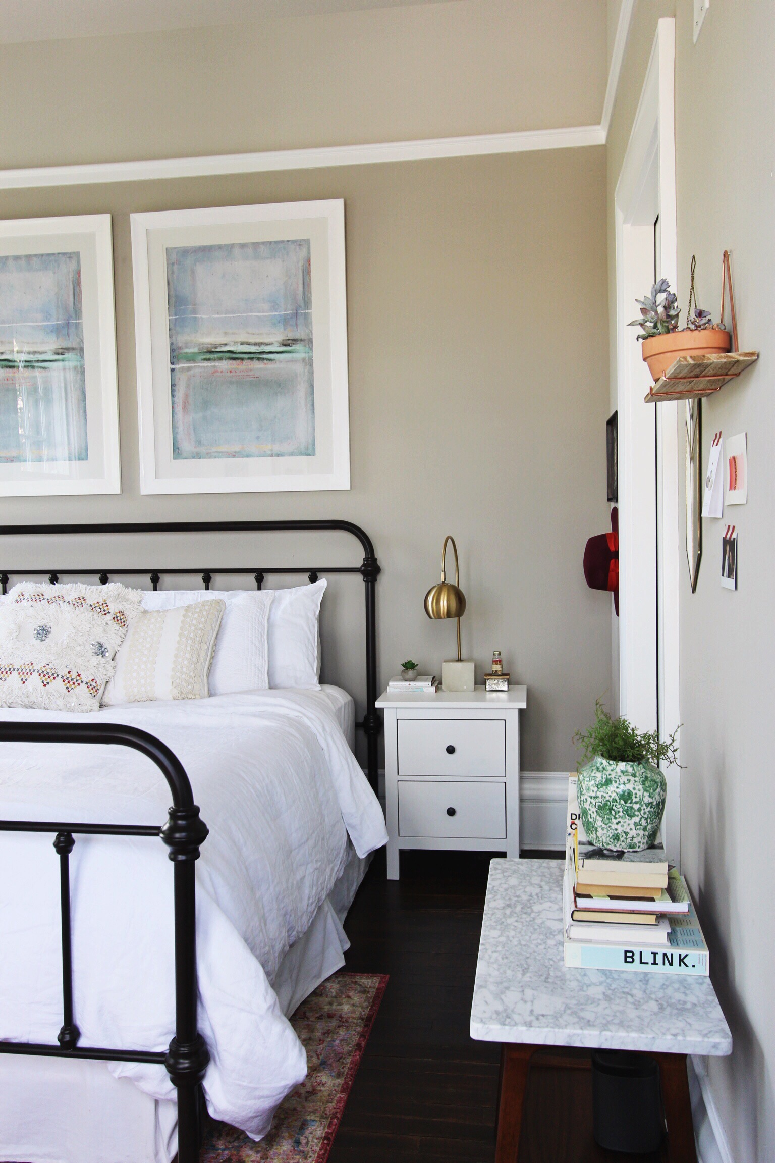
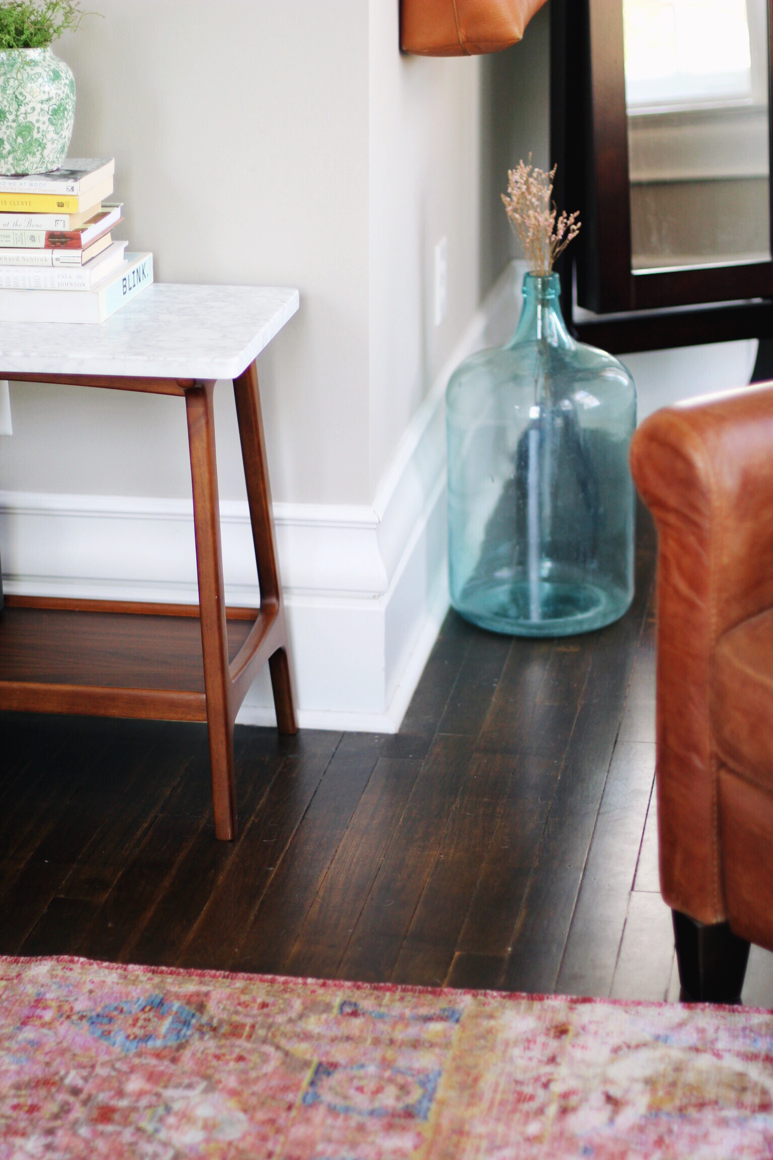
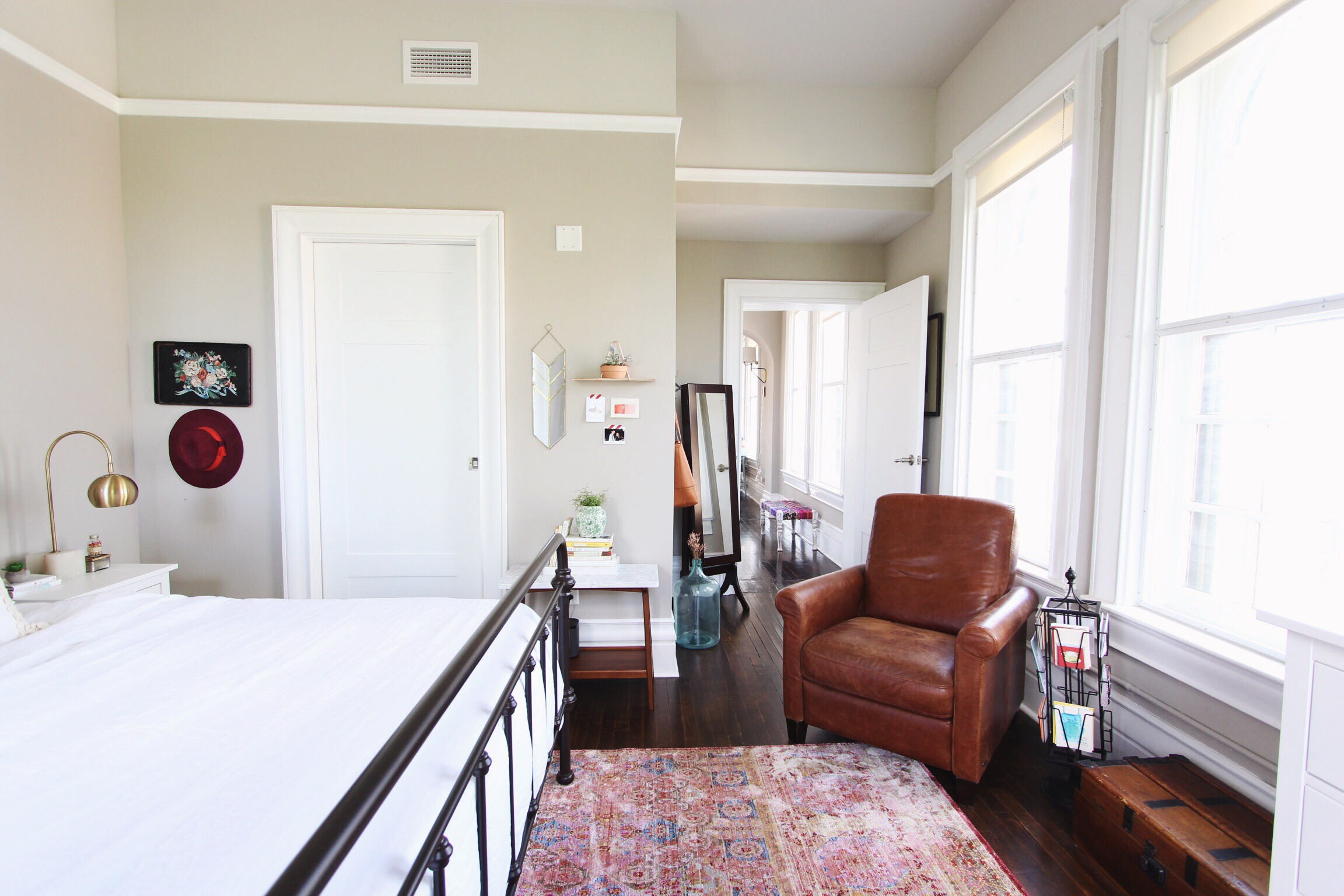
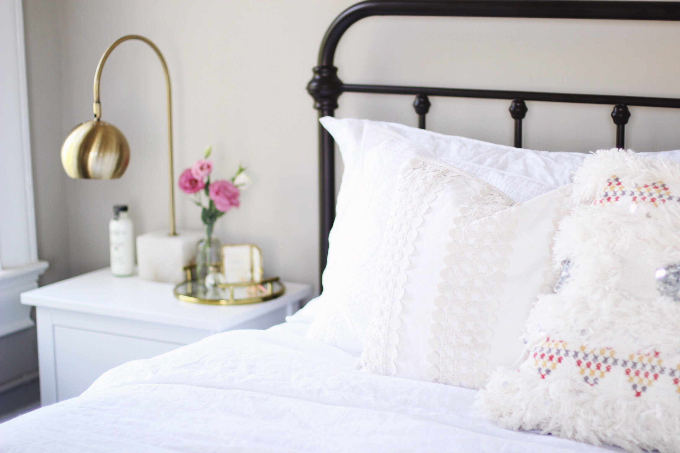
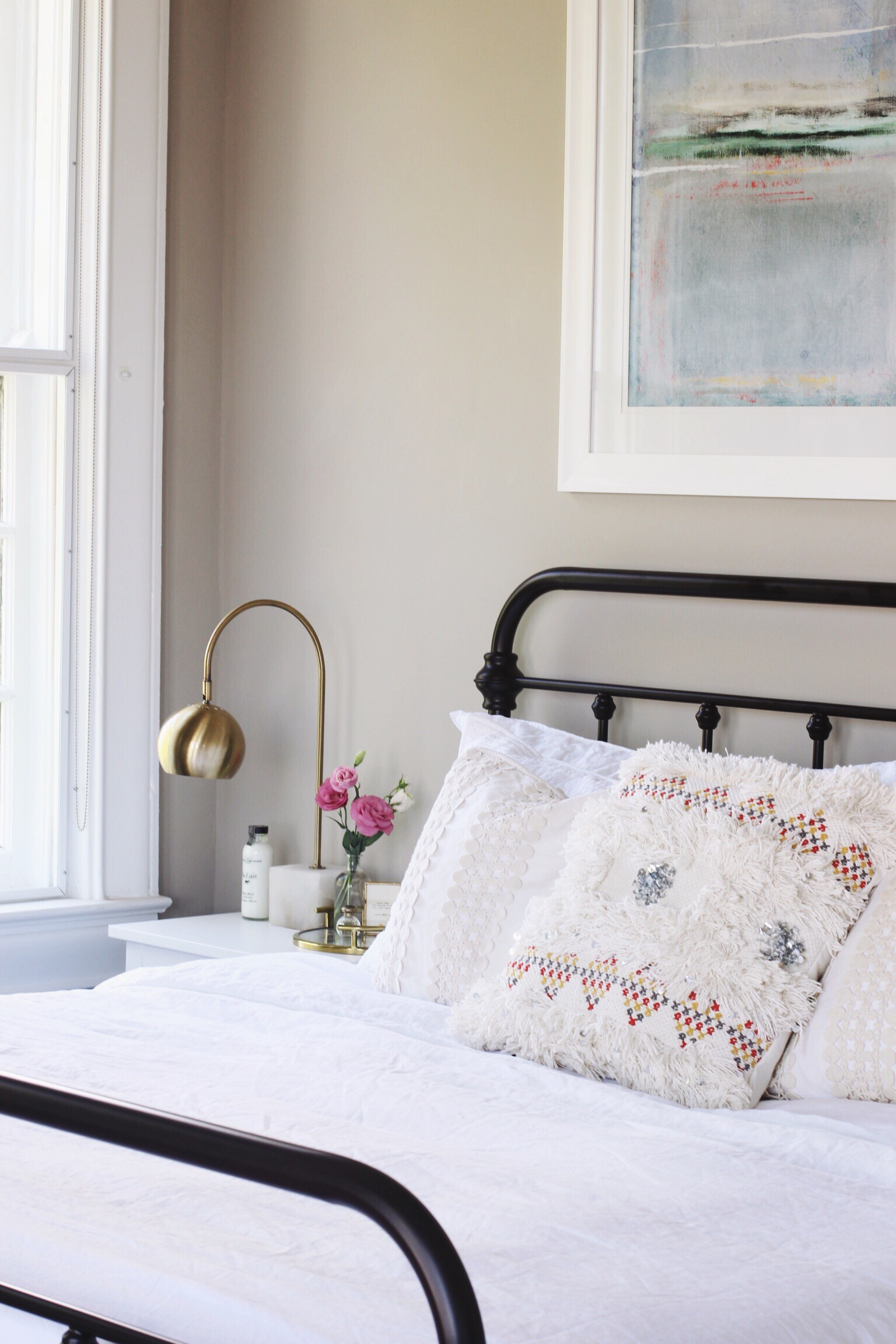
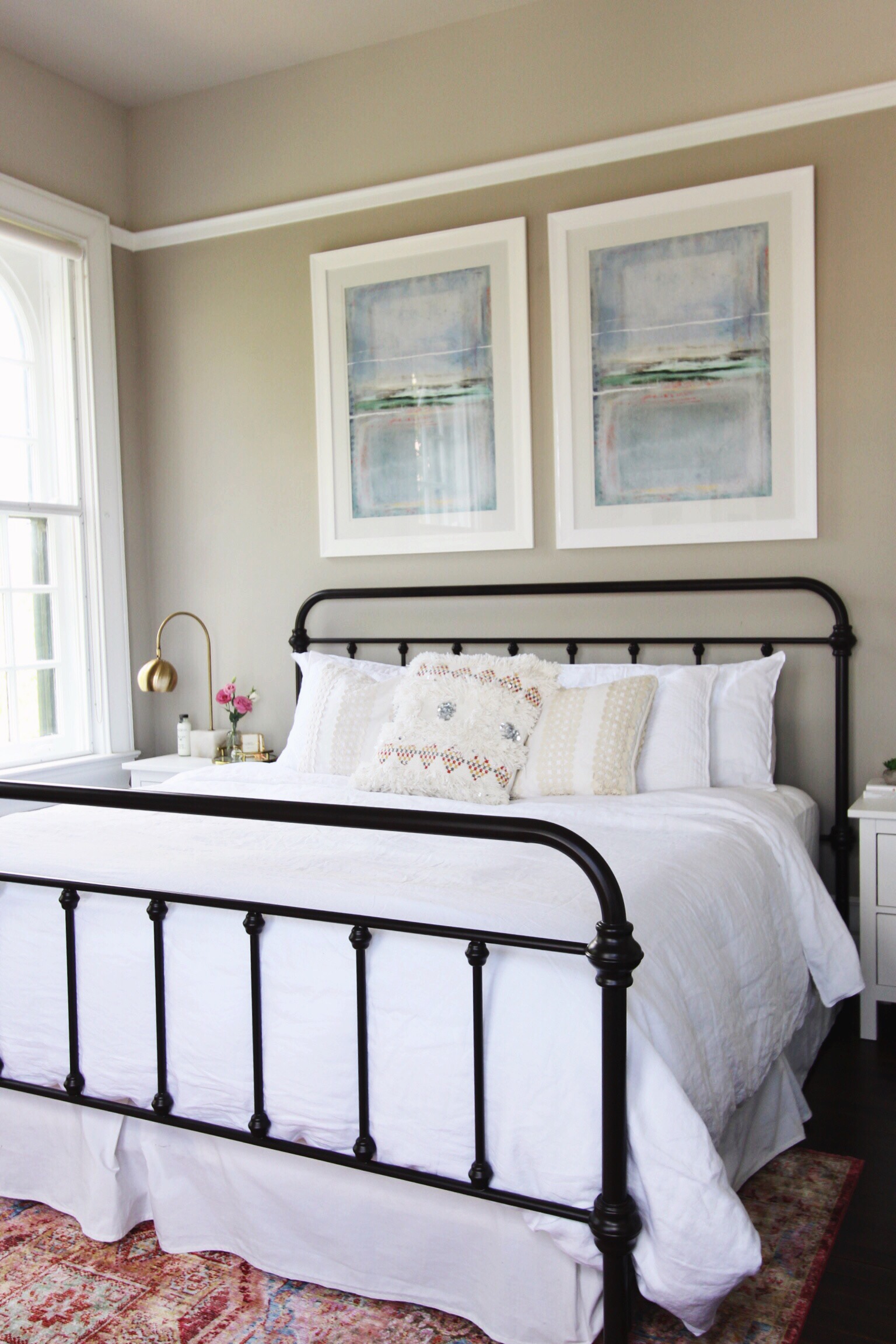
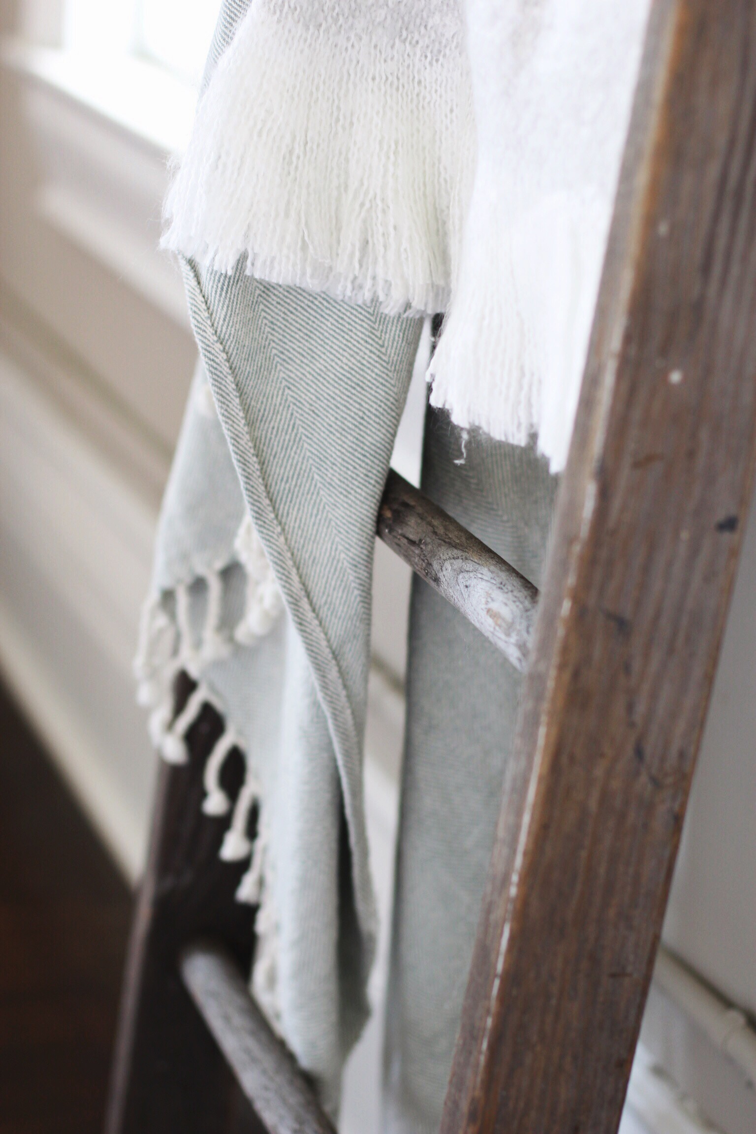
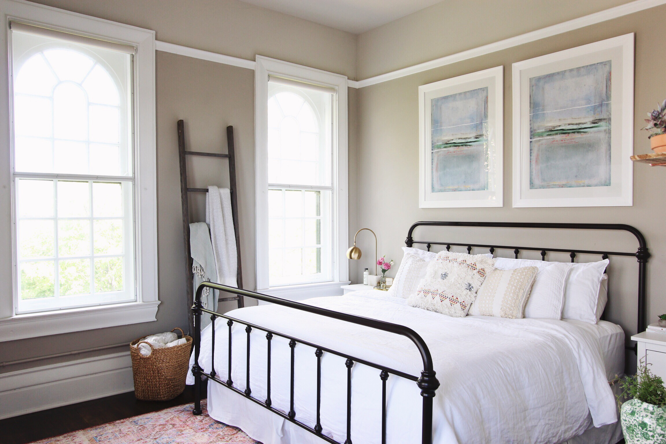
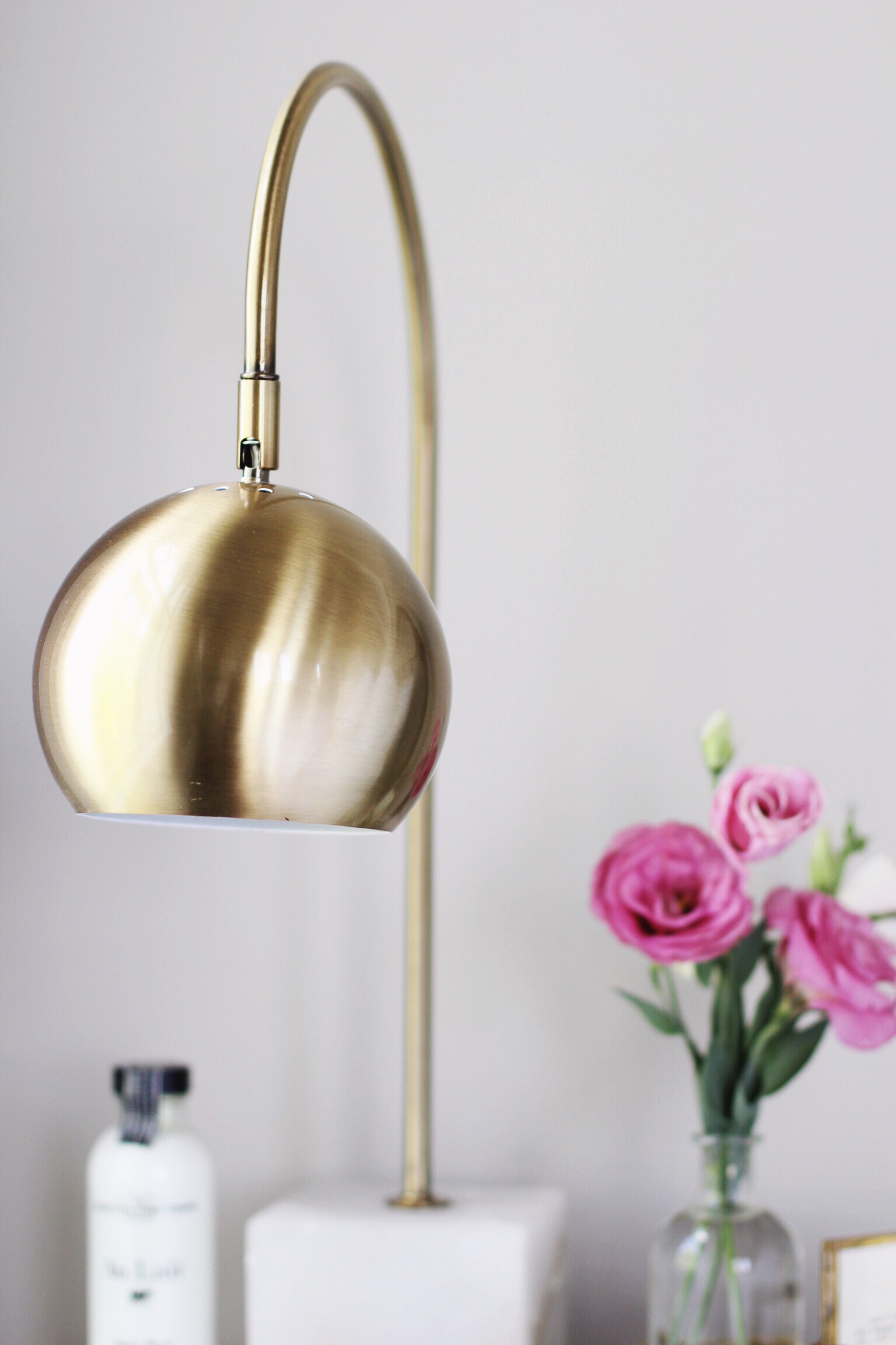
After first purchasing the bed frame (something neither Jon nor I has had since... early childhood? Very exciting!), I was scared to clash with the dark color of the metal. I was comfortable with the white furniture that we already owned, but I didn't know how to incorporate other metals or other wood tones. But when the bed frame was just paired with the white pieces, it looked a little boring to me, and also a little too stark for my liking. So to experiment, I wandered around the rest of our apartment to pull pieces and see how they looked in the bedroom. When I leaned the grayish-tone wood ladder against the wall, I knew I was onto something. Next, I folded and hung some different blankets on it. But then I went against my neat-natured instincts and strewed the blankets across the ladder, instead. I loved the result. I also brought a mid-century style walnut-legged side table in, having an anxious feeling that there was no way the wood would "go." To my surprise, I felt I was achieving the imperfect look I was going for, just by making myself challenge my own instincts, essentially. The same was true for the basket (which was previously being used as an out-of-sight hamper), and I loved that it brought yet another color and texture to soften the space, just like the rustic wood ladder. Lastly, the lamps really helped round it all out. I was nervous about the brass with all of the white, gray, and black, but they were strangely just what the room needed. Their marble bases helped keep things feeling warm and vintagey, too.
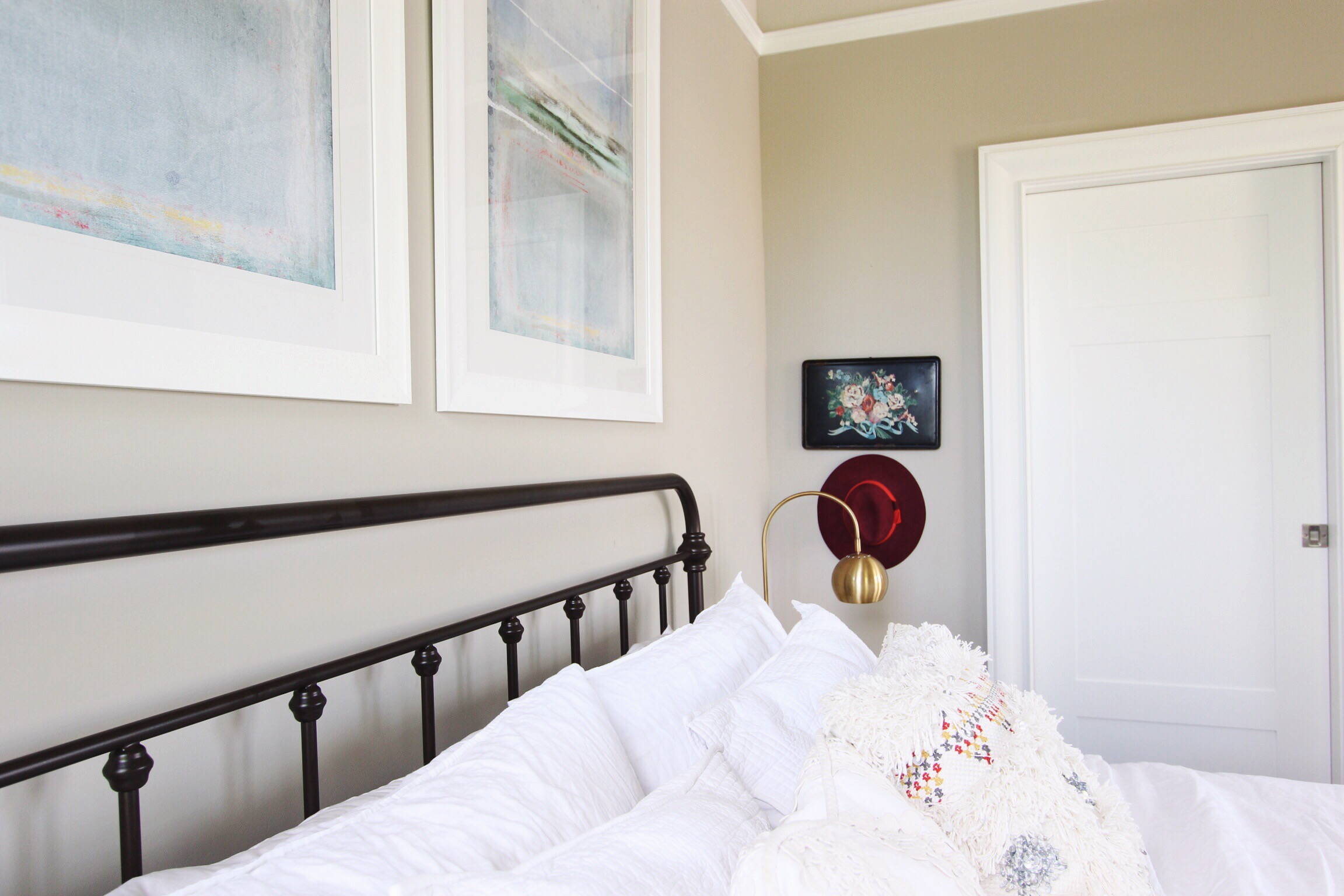
For the walls, I was feeling a similar predicament. Because we'd already bought the rug, I was concerned with how to match with it and pull from it. For the artwork above the bed, I was initially leaning towards one large piece, and I was narrowing down abstract choices on Minted. I was a little sick over the price it was going to be (for an art "print"), so I couldn't commit. I'm really glad I didn't, because we ended up finding these two pieces at HomeGoods for about 1/4 of the price, and decided they'd look cool hung vertically together to really show off the ceiling height. This was a great lesson in keeping an open mind because although I wasn't thrilled with them in the store, I think they are perfect for the room, and at a perfect price point, too.
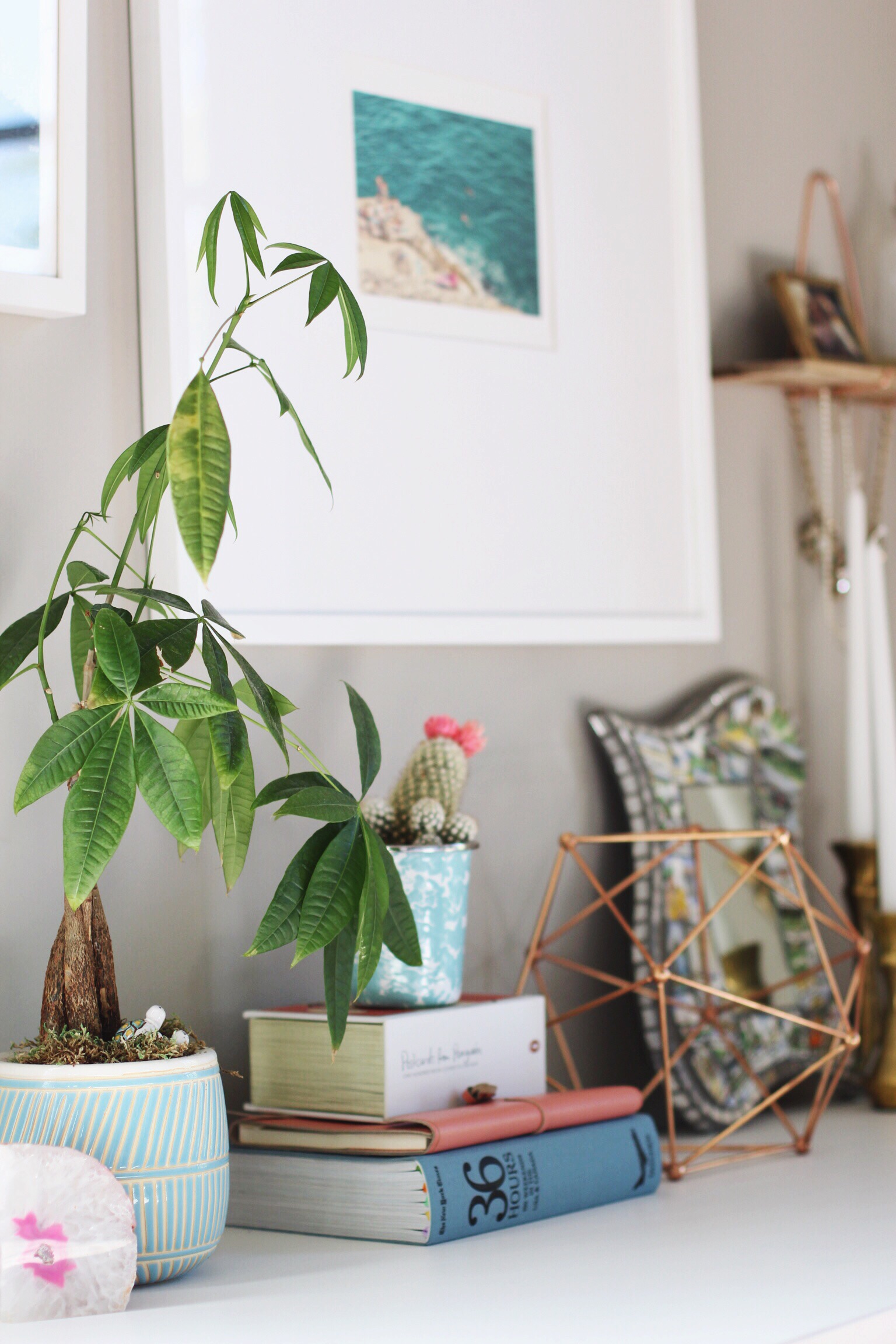
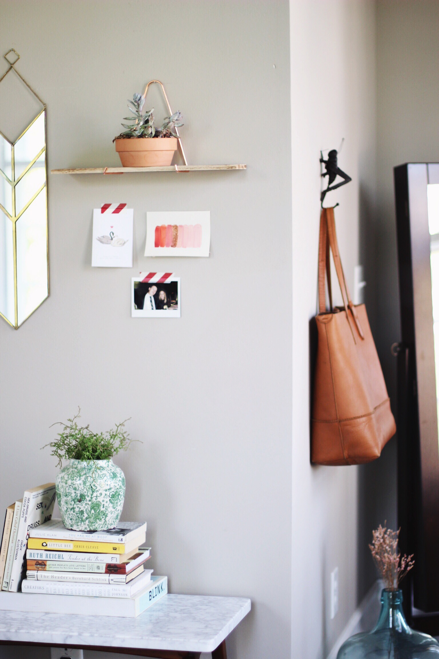
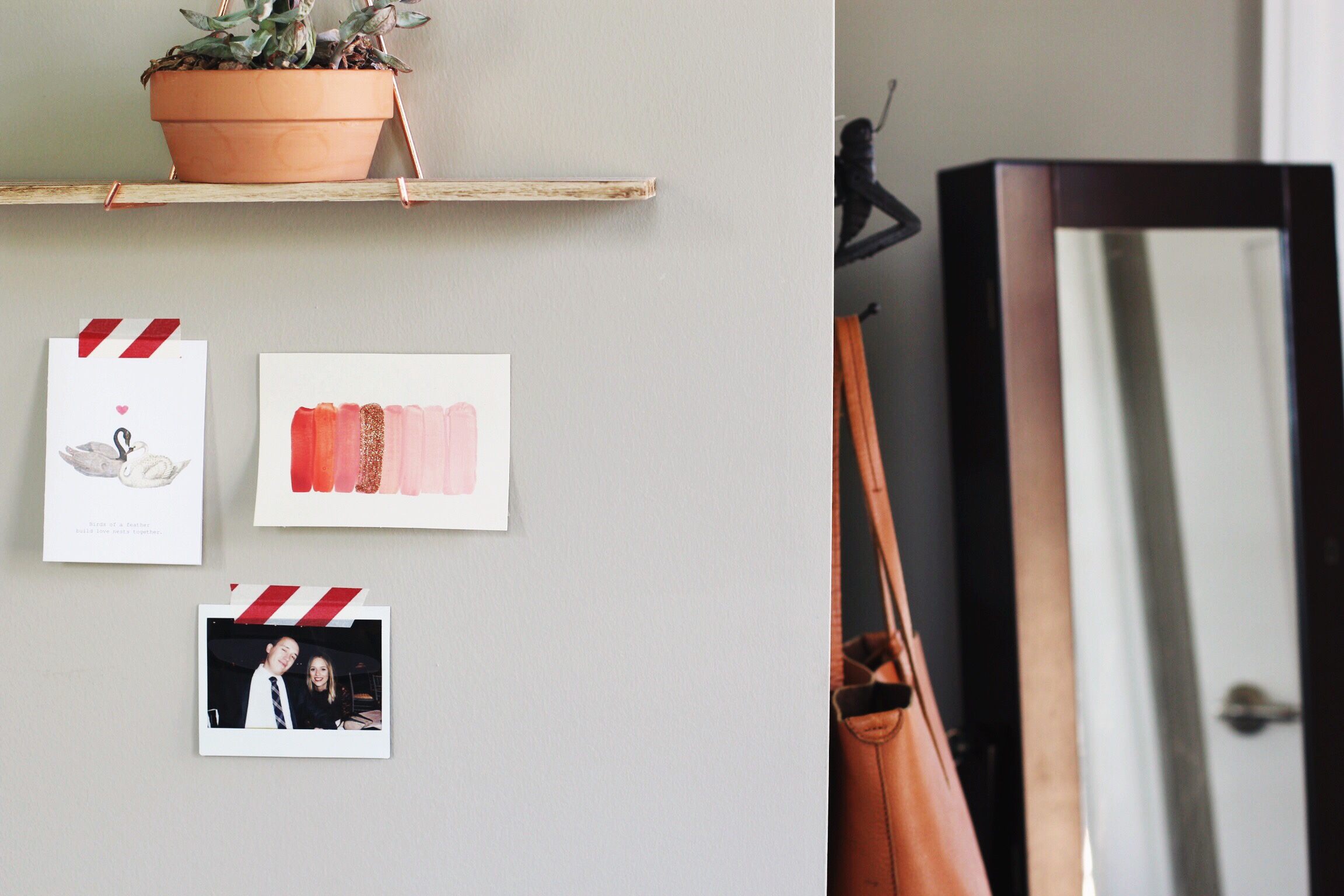
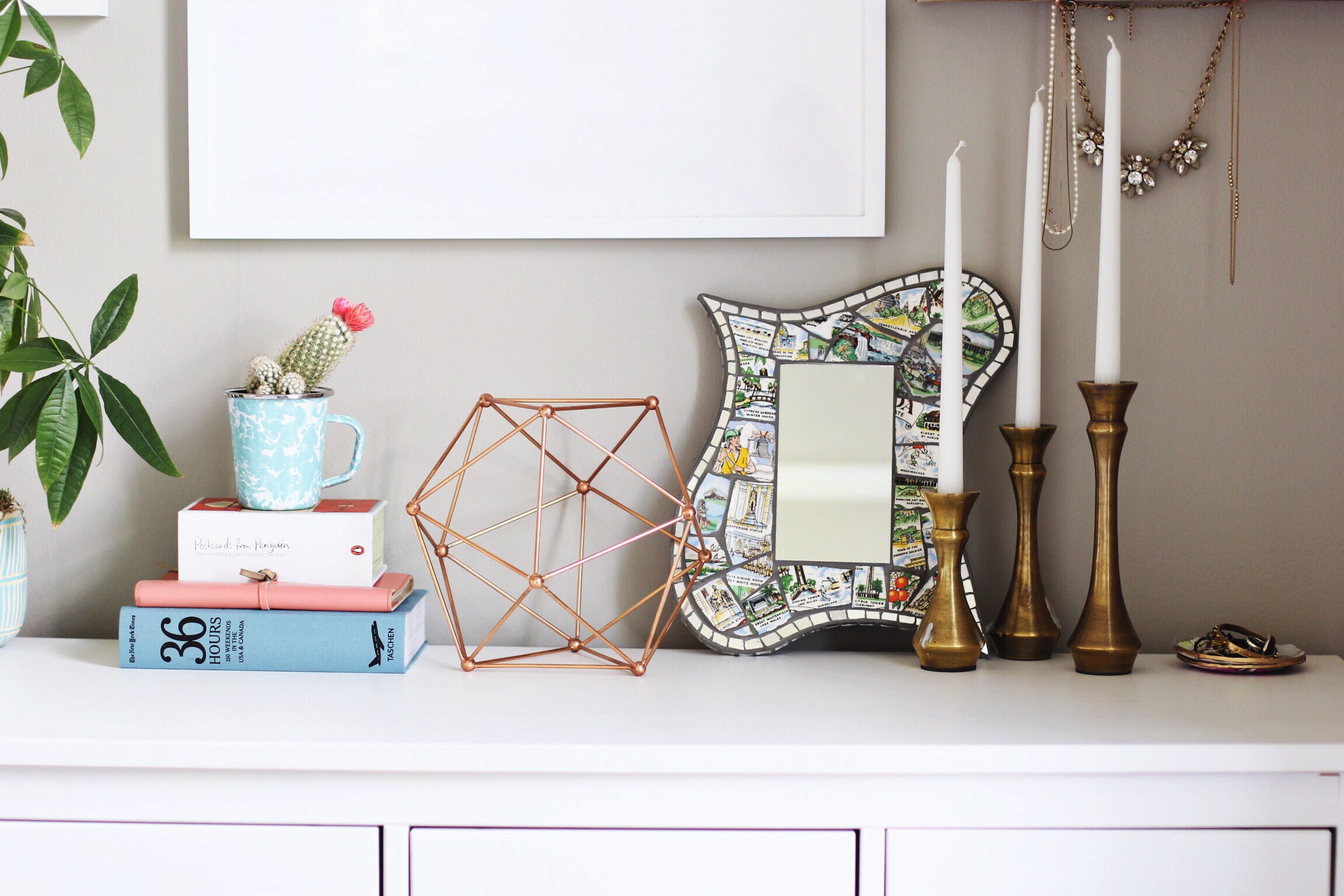
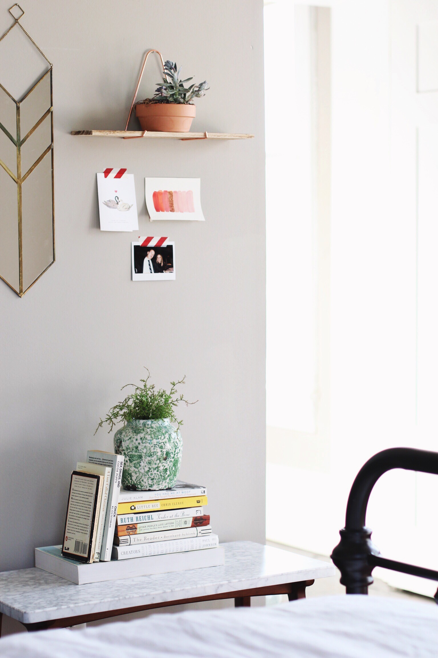
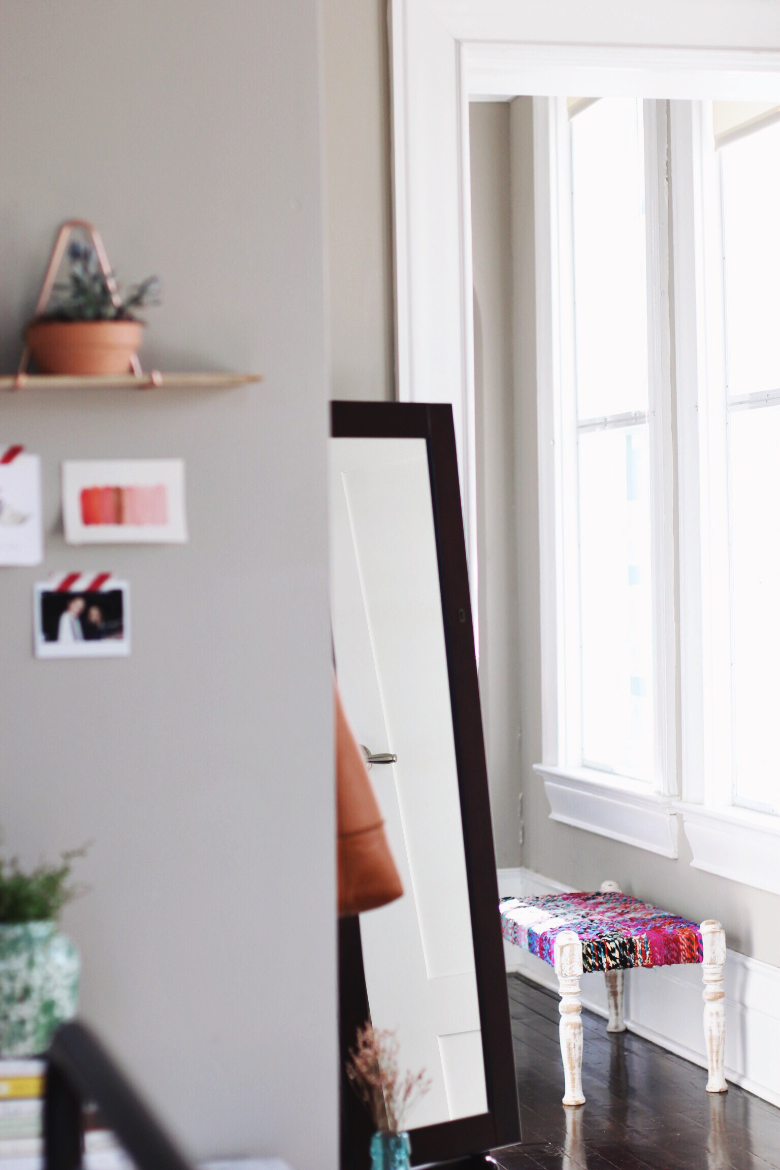
For the rest of the walls, I didn't exactly know where to start. But I just experimented! I'd hold things up together, and then rearrange them. All of the art were things I had been collecting (house sales, antique shops, and yard sales are great for cool vintage finds). I quickly learned that I wanted to have one "busy" gallery-ish wall, and have the rest feel much more organic and less planned out. I did this by limiting myself on the other walls to less than what felt comfortable. I'd been seeing little tiny photo vignettes in rooms on Pinterest, and I loved the light, unrefined look of it, and the slight lack of cohesion with the rest of the room. The same was true for hanging a hat and an old vintage tray. All of it felt just disparate enough, but still felt in tune with the overall vibe I was going for. It just really took a lot of experimenting!
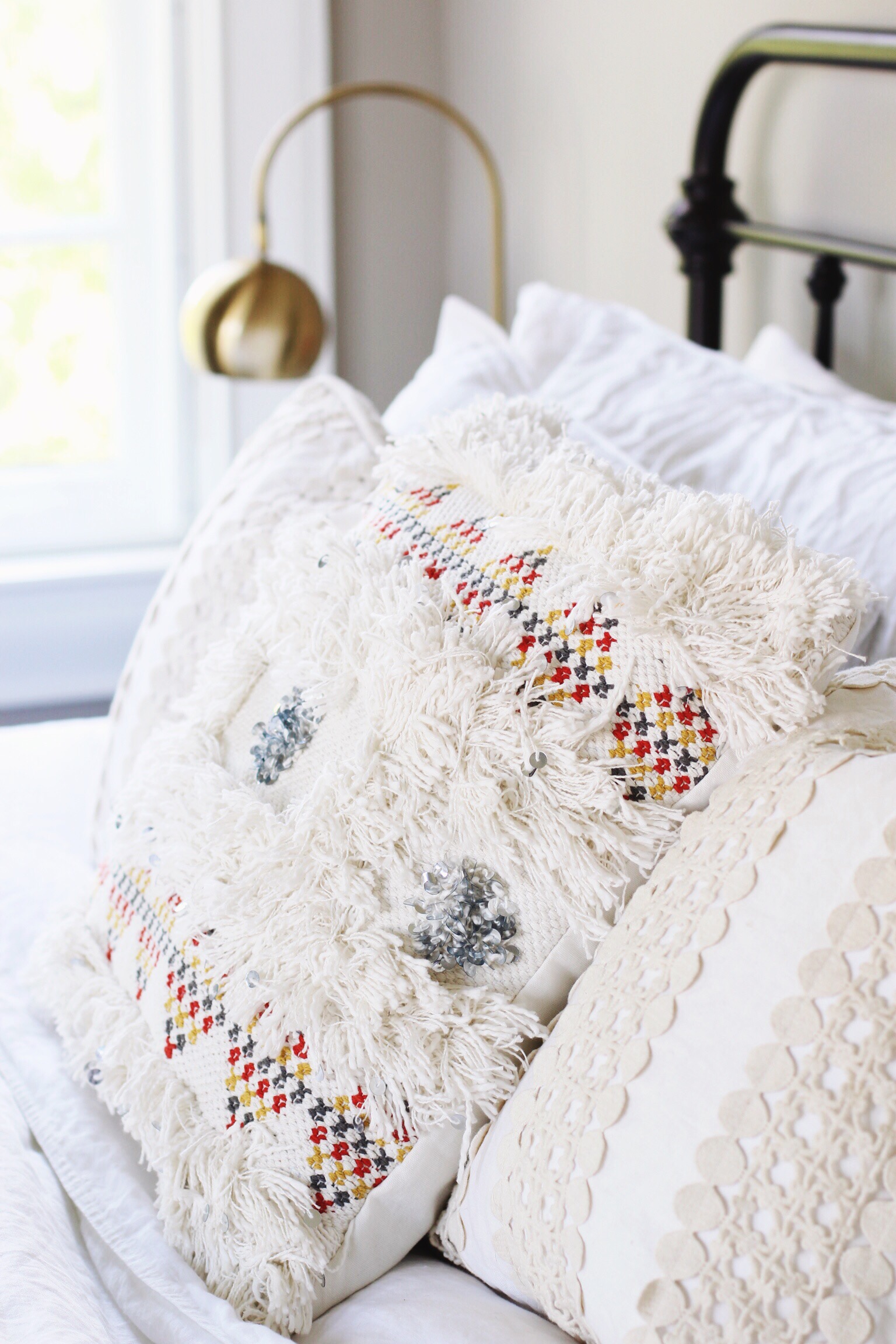
I have always loved the idea of white bedding (especially linen! Thanks H&M for making it affordable and machine washable). It's crisp, clean, and inviting (but, not gonna lie, seemingly impossible with a dog, so stay tuned). The throw pillows don't stray too far from the white theme, but they offer texture and interest, which I love.
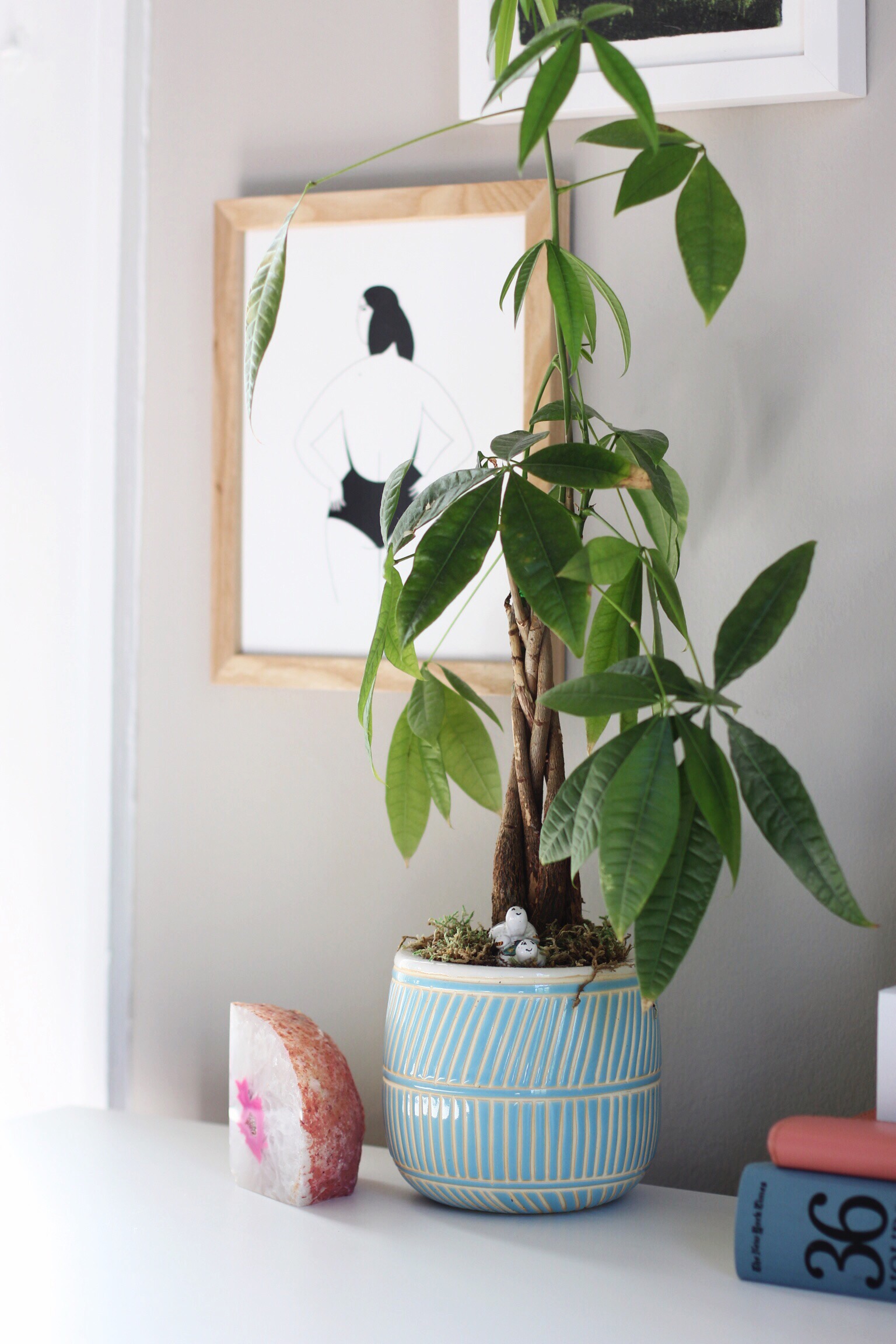
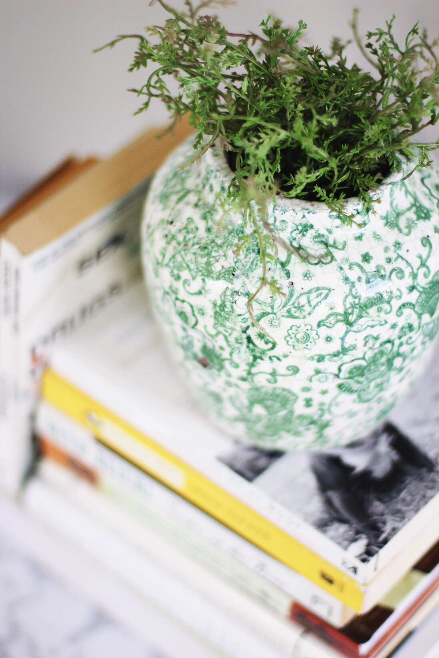
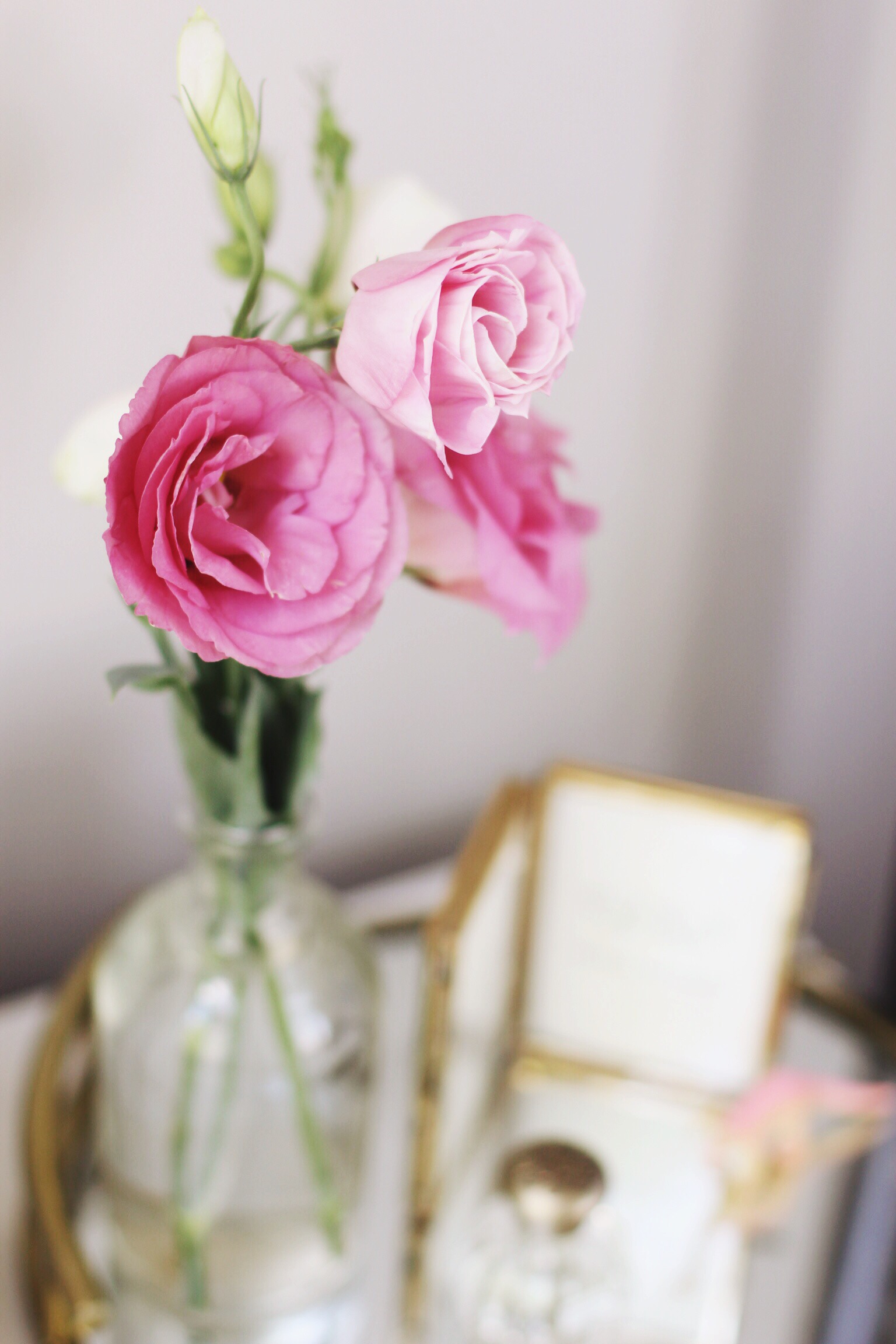
Overall, the color scheme helps to keep the room feeling grounded and really, really cozy. The repetition of white is enough to tie everything together, but there is enough else going on to keep things interesting. And one of the biggest things I've learned: plants, fresh flowers, and books help give every space a Bohemian, lived-in feel that is really hard to achieve without them. Visually, they are both interesting and beautiful. Pick your favorites, and the ones with interesting looks or great color, and arrange them around in different fashions.
I hope you like it!
At the end, I've tagged those items that are available for purchase on the Inter-webs.
A little guide...
a: artwork (HomeGoods)
b: bed frame (Hayneedle)
c: lamps (HomeGoods)
d: nightstands (IKEA)
e: rug (eSalerugs)
f: linen duvet (H&M)
g: pillows (Anthropologie)
h: pillow (HomeGoods)
i: basket (HomeGoods)
j: ladder (antique sale)
k: tray (antique sale)
l: hat (Anthropologie)
m: pennant mirror (Urban Outfitters)
n: shelf (Urban Outfitters)
o: jewelry cabinet (HomeGoods)
p: planter (Anthropologie)
q: side table (West Elm)
r: glass jug (antique sale)
s: leather chair (Marshalls)
t: card/photo carousel (Pottery Barn)
u: trunk (antique)
v: dresser (IKEA)
w: art print (Minted)
x: art print (Urban Outfitters)
y: art print, oversized frame (Minted, Pottery Barn)
z: geode (Marshalls)
aa: planter (HomeGoods)
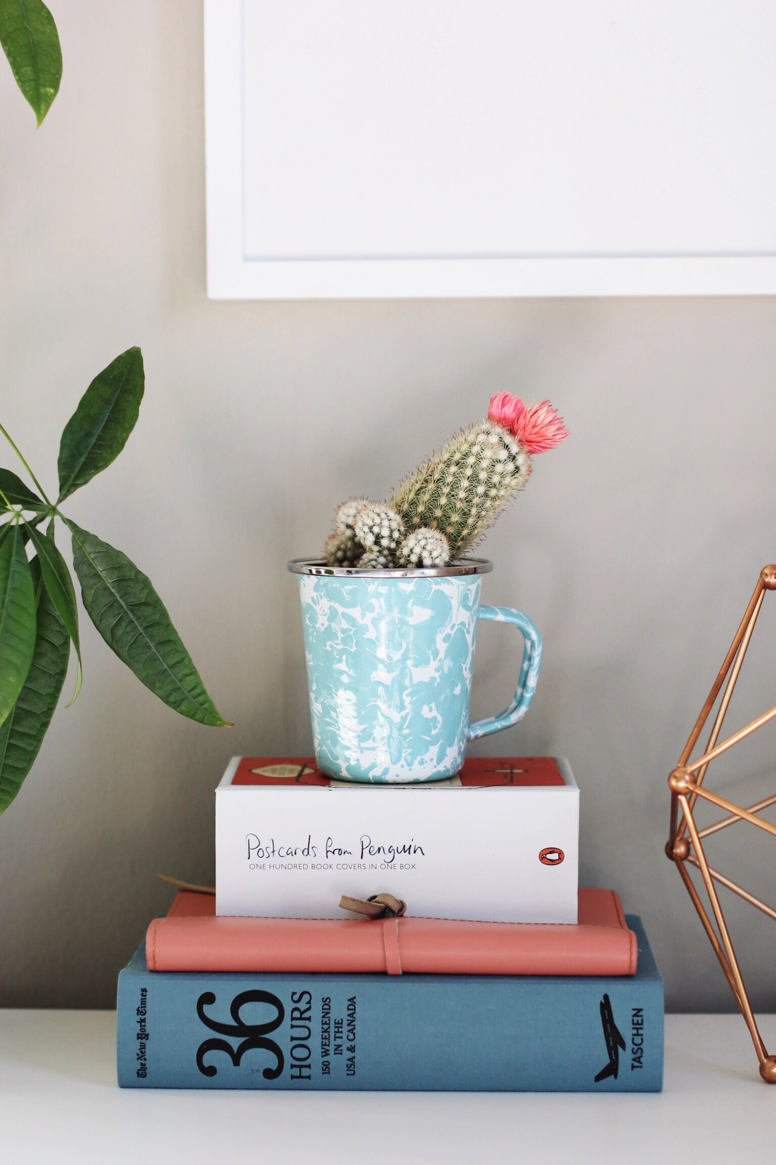
bb: enamel mug (gift)
cc: copper decor (HomeGoods)
dd: mosaic city mirror (custom)
ee: shelf (Urban Outfitters)
ff: candlesticks (Serena & Lily)